2 axes des ordonnées avec twinx() sur Python

Bonjour,
j'aimerais représenter 2 courbes sur un même graphe, avec un axe des ordonnées à gauche (pour la courbe rouge) et un à droite (pour la courbe bleue), et ce pour 4 fonctions différentes.
J'utilise subplots afin d'avoir mes 4 graphes sur une même figure. Actuellement j'obtiens 2 figures contenant chacune les 4 graphes (pour la courbe rouge et pour la courbe bleue ). Comment faire pour n'avoir qu'une figure de 4 graphes avec chacun les 2 courbes? D'après mes recherches, il faut utiliser twinx(), mais je ne comprends pas comment le mettre dans mon code.
Merci d'avance
from math import *
from matplotlib.pyplot import plot, show, legend

import numpy as np
import matplotlib.pyplot as plt


def f(x):
    p=0.01
    return (1/x)*sqrt((1-(1-p)**x)/(1-p)**x)

def f1(x):$
    p=0.03
    return (1/x)*sqrt((1-(1-p)**x)/(1-p)**x)

def f2(x):
    p=0.05
    return (1/x)*sqrt((1-(1-p)**x)/(1-p)**x)

def f3(x):
    p=0.15
    return (1/x)*sqrt((1-(1-p)**x)/(1-p)**x)

x = [ i for i in range(1,600) ]
y = [ f(a) for a in range(1,600) ]
yp= [ a*f(a) for a in range(1,600) ]

x1 = [ i for i in range(1,175) ]
y1 = [ f1(a) for a in range(1,175) ]
y1p = [ a*f1(a) for a in range(1,175) ]

x2=[ i for i in range(1,100) ]
y2=[ f2(a) for a in range(1,100) ]
y2p=[ a*f2(a) for a in range(1,100) ]

x3=[ i for i in range(1,25) ]
y3=[ f3(a) for a in range(1,25) ]
y3p=[ a*f3(a) for a in range(1,25) ]

plt.figure(1)

plt.subplot(221)
plt.plot(x,y, 'r-')
plt.xlabel('bla')
plt.ylabel('blabla')
plt.title('p=1%')

plt.subplot(222)
plt.plot(x1, y1, 'r-')
plt.xlabel('bla')
plt.ylabel('blabla')
plt.title('p=3%')

plt.subplot(223)
plt.plot(x2,y2, 'r-')
plt.xlabel('bla')
plt.ylabel('blabla')
plt.title('p=5%')
plt.subplot(224)

plt.plot(x3,y3, 'r-')
plt.xlabel('bla')
plt.ylabel('blabla')
plt.title('p=15%')

show()

plt.figure(2)

plt.subplot(221)
plt.plot(x,yp, 'b-')
plt.xlabel('bla')
plt.ylabel('blabla2')
plt.title('p=1%')

plt.subplot(222)
plt.plot(x1, y1p, 'b-')
plt.xlabel('bla')
plt.ylabel('blabla2')
plt.title('p=3%')

plt.subplot(223)
plt.plot(x2,y2p, 'b-')
plt.xlabel('bla')
plt.ylabel('blabla2')
plt.title('p=5%')
plt.subplot(224)

plt.plot(x3,y3p, 'b-')-
plt.xlabel('bla')
plt.ylabel('blabla2')
plt.title('p=15%')

show()
Réponses
-
fifi21 a écrit:Comment faire > pour n'avoir qu'une figure de 4 graphes avec > chacun les 2 courbes? D'après mes recherches, il > faut utiliser twinx(), mais je ne comprends pas > comment le mettre dans mon code.
Entends-tu par là avoir pour chaque courbe 2 ordonnées (axe secondaire, comme sous Excel) ? car sinon il y a un "show()" en trop (voir code)
voir ici ou là
A noter qu'il y a moyen de n'utiliser qu'une seule fonction, non ? (sauf erreur de ma part)
Paulfrom matplotlib.pyplot import plot, show, legend import numpy as np import matplotlib.pyplot as plt def fonction(p, n): x = np.arange(1, n) y = (1/x)*np.sqrt((1-(1-p)**x)/(1-p)**x) yp = x*y return(x, y, yp) x, y, yp = fonction(p=0.01, n=600) x1, y1, y1p = fonction(p=0.03, n=175) x2, y2, y2p = fonction(p=0.05, n=100) x3, y3, y3p = fonction(p=0.15, n=25) plt.figure(1) plt.subplot(221) plt.plot(x,y, 'r-') plt.xlabel('bla') plt.ylabel('blabla') plt.title('p=1%') plt.subplot(222) plt.plot(x1, y1, 'r-') plt.xlabel('bla') plt.ylabel('blabla') plt.title('p=3%') plt.subplot(223) plt.plot(x2,y2, 'r-') plt.xlabel('bla') plt.ylabel('blabla') plt.title('p=5%') plt.subplot(224) plt.plot(x3,y3, 'r-') plt.xlabel('bla') plt.ylabel('blabla') plt.title('p=15%') # show() plt.figure(1) plt.subplot(221) plt.plot(x,yp, 'b-') plt.xlabel('bla') plt.ylabel('blabla2') plt.title('p=1%') plt.subplot(222) plt.plot(x1, y1p, 'b-') plt.xlabel('bla') plt.ylabel('blabla2') plt.title('p=3%') plt.subplot(223) plt.plot(x2,y2p, 'b-') plt.xlabel('bla') plt.ylabel('blabla2') plt.title('p=5%') plt.subplot(224) plt.plot(x3,y3p, 'b-') plt.xlabel('bla') plt.ylabel('blabla2') plt.title('p=15%') show() -
Bonjour,
Déjà merci pour l'ajout d'une seule fonction, je n'y avais pas pensé. Mais le problème est toujours le même : la courbe bleue et la courbe rouge partagent le même axe des ordonnées et de ce fait, la courbe rouge est écrasée.
Je ne fonctionne pas sous excel donc je ne sais pas mais j'aimerais qu'il y ait un axe des ordonnées à gauche (avec sa propre légende, correspondant à celui de la courbe rouge) et un autre à droite (avec sa propre légende, correspondant à celui de la courbe bleue) qui ne soient pas à la même échelle, et donc que chaque courbe ait la bonne forme sans être aplatie.
Les liens ne semblent pas correspondre à ce que je recherche. Il me semblait avoir trouvé qu'il fallait utiliser la commande twinx() (voir la pièce jointe), mais je n'arrive pas à adapter les codes proposés à mon cas de figure, vu que j'ai déjà des subplots.
Merci -
J'y arrive sur 1 courbe (j'imagine que c'est aussi ton cas) , mais pas sur les 4 ; je ne ma^trise pas assez Matplotlib
Chemin = str(os.getcwd())

fig, axe1_X = plt.subplots()
axe2_X = axe1_X.twinx()
axe1_X.plot(x, y, 'b-')
axe2_X.plot(x, yp, 'r-')
axe1_X.set_xlabel('X data')
axe1_X.set_ylabel('Y data', color='g')
axe2_X.set_ylabel('Yp data', color='b')
plt.savefig(Chemin + '/fig221.png', dpi=300)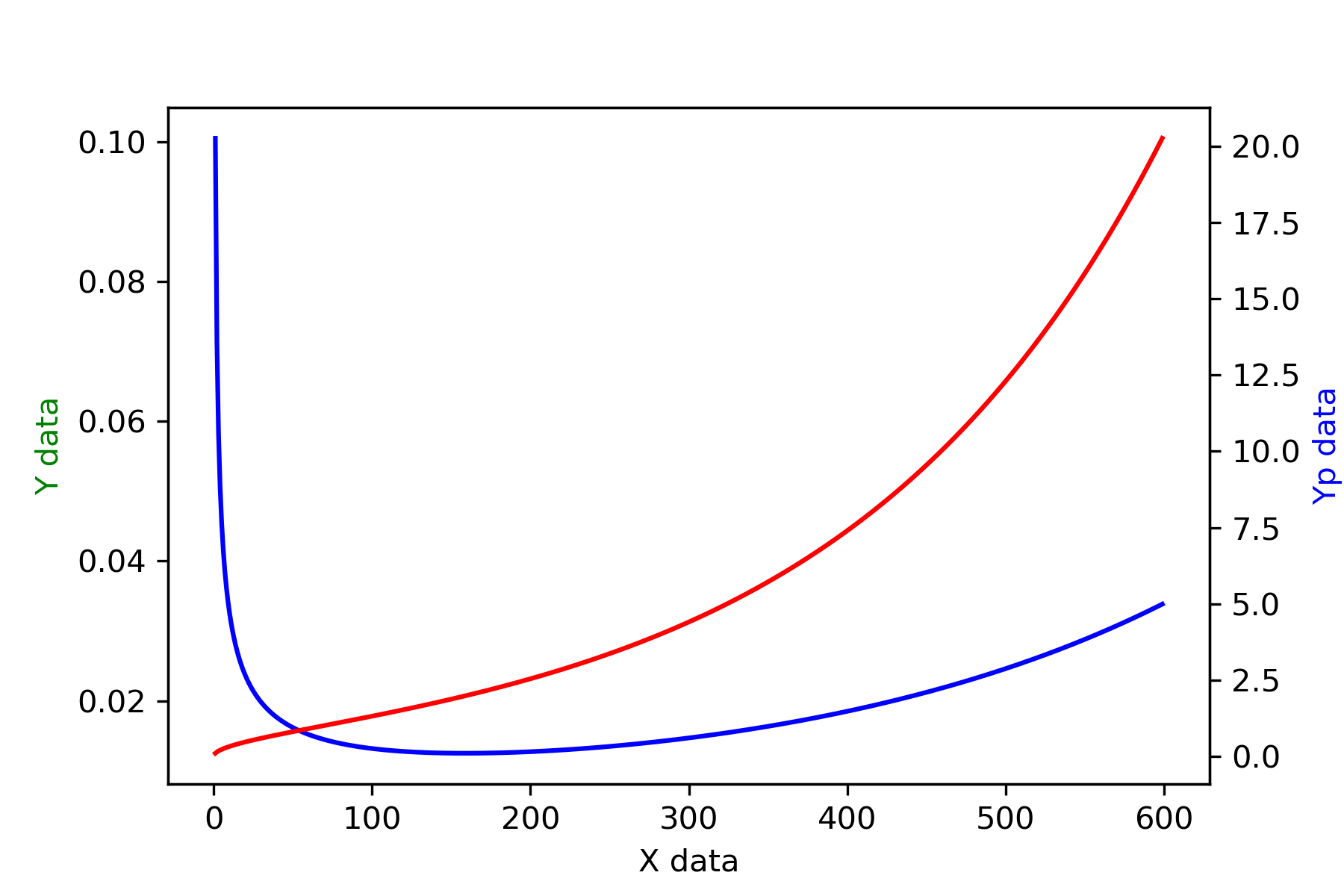
-
Oui voilà, j'ai le même problème.
Tant pis, je vais essayer de faire du bidouillage et des captures d'écran pour faire apparaitre les 4 figures sur une même page.
Merci de votre aide !
Bonne journée -
un peu mieux, mais pas encore ça; si je remplace "plt.subplots(4)" par "plt.subplots(2,2)" ça ne fonctionne plus
Chemin = str(os.getcwd())

fig, (axe11_X, axe21_X, axe31_X, axe41_X) = plt.subplots(4)
# fig 1
axe12_X = axe11_X.twinx()
axe11_X.plot(x, y, 'b-')
axe12_X.plot(x, yp, 'r-')
axe11_X.set_xlabel('X data')
axe11_X.set_ylabel('Y data', color='b')
axe12_X.set_ylabel('Yp data', color='r')

#fig 2
axe22_X = axe21_X.twinx()
axe21_X.plot(x1, y1, 'b-')
axe22_X.plot(x1, y1p, 'r-')
axe21_X.set_xlabel('X1 data')
axe21_X.set_ylabel('Y1 data', color='b')
axe22_X.set_ylabel('Y1p data', color='r')

#fig 3
axe32_X = axe31_X.twinx()
axe31_X.plot(x2, y2, 'b-')
axe32_X.plot(x2, y2p, 'r-')
axe31_X.set_xlabel('X2 data')
axe31_X.set_ylabel('Y2 data', color='b')
axe32_X.set_ylabel('Y2p data', color='r')

#fig 4
axe42_X = axe41_X.twinx()
axe41_X.plot(x3, y3, 'b-')
axe42_X.plot(x3, y3p, 'r-')
axe41_X.set_xlabel('X3 data')
axe41_X.set_ylabel('Y3 data', color='b')
axe42_X.set_ylabel('Y3p data', color='r')

plt.savefig(Chemin + '/fig.png', dpi=300)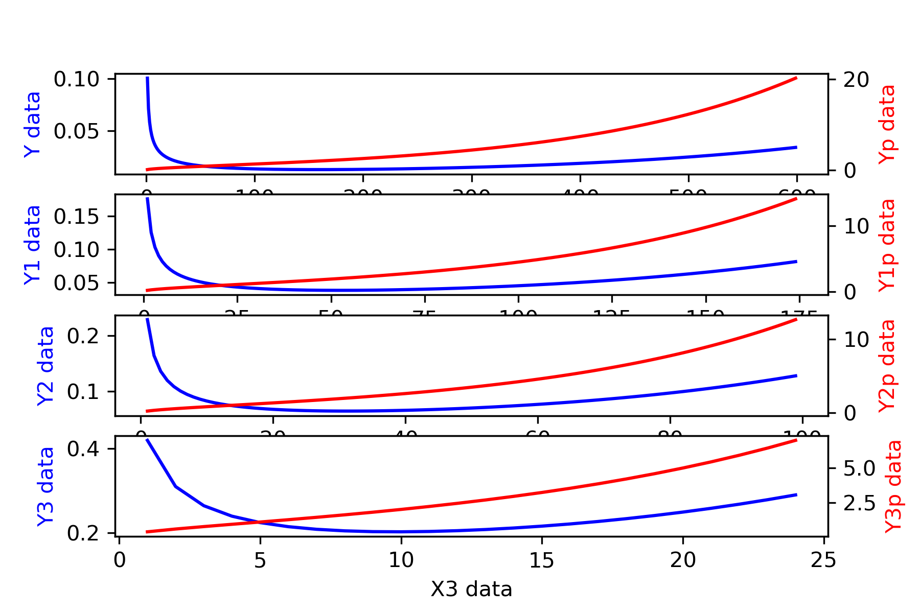
-
c'est de la bidouille, mais c'est plus propre avec la modification suivante
fig, (axe11_X, axe21_X, axe31_X, axe41_X) = plt.subplots(4, figsize=(16,16))
-
Effectivement, ce n'est pas loin du résultat souhaité. J'ai essayé aussi plusieurs manipulations de ce type mais en vain. Ce n'est pas grave.
merci -
eureka (ça m'a agacé de ne pas y arriver :-D) ; je me suis aidé de ce site.
(pour la cosmétique, je laisse fifi21 faire ses tests)Chemin = str(os.getcwd()) fig = plt.figure(figsize=(16,16)) fig.subplots_adjust(hspace=0.4, wspace=0.4) # fig 1 i = 1 axe11_X = fig.add_subplot(2, 2, i) axe12_X = axe11_X.twinx() axe11_X.plot(x, y, 'b-') axe12_X.plot(x, yp, 'r-') axe11_X.set_xlabel('X data') axe11_X.set_ylabel('Y data', color='b') axe12_X.set_ylabel('Yp data', color='r') #fig 2 i = 2 axe21_X = fig.add_subplot(2, 2, i) axe22_X = axe21_X.twinx() axe21_X.plot(x1, y1, 'b-') axe22_X.plot(x1, y1p, 'r-') axe21_X.set_xlabel('X1 data') axe21_X.set_ylabel('Y1 data', color='b') axe22_X.set_ylabel('Y1p data', color='r') #fig 3 i = 3 axe31_X = fig.add_subplot(2, 2, i) axe32_X = axe31_X.twinx() axe31_X.plot(x2, y2, 'b-') axe32_X.plot(x2, y2p, 'r-') axe31_X.set_xlabel('X2 data') axe31_X.set_ylabel('Y2 data', color='b') axe32_X.set_ylabel('Y2p data', color='r') #fig 4 i = 4 axe41_X = fig.add_subplot(2, 2, i) axe42_X = axe41_X.twinx() axe41_X.plot(x3, y3, 'b-') axe42_X.plot(x3, y3p, 'r-') axe41_X.set_xlabel('X3 data') axe41_X.set_ylabel('Y3 data', color='b') axe42_X.set_ylabel('Y3p data', color='r') plt.savefig(Chemin + '/fig.png', dpi=300) -
wow merci beaucoup c'est exactement ce qu'il me fallait !
-
Je me suis fait quelques modèles de test en y ajoutant de la couleur, des grilles, un peu de Latex ... B-)
import numpy as np
import matplotlib.pyplot as plt
import os

def fonction(p, n):
    x = np.arange(1, n)
    y = (1/x)*np.sqrt((1-(1-p)**x)/(1-p)**x)
    yp = x*y
    return(x, y, yp)

x, y, yp = fonction(p=0.01, n=600)
x1, y1, y1p = fonction(p=0.03, n=175)
x2, y2, y2p = fonction(p=0.05, n=100)
x3, y3, y3p = fonction(p=0.15, n=25)


Chemin = str(os.getcwd())
fig = plt.figure(figsize=(16,16))
fig.subplots_adjust(hspace=0.4, wspace=0.4)

# fig 1
i = 1
axe11_X = fig.add_subplot(2, 2, i)
axe12_X = axe11_X.twinx()
axe11_X.grid(which='major', linestyle='-', linewidth='1.', color='black')
axe11_X.grid(which='minor', linestyle=':', linewidth='0.5', color='blue')
axe11_X.plot(x, y, 'b-')
axe12_X.plot(x, yp, 'r-')
axe11_X.set_xlabel('X data', fontweight='bold')
axe11_X.set_ylabel('Y data', color='b', fontweight='bold')
axe12_X.set_ylabel(r'$Y_p$ data - $y_p = \frac{1}{x} \sqrt{ ( 1 - ( 1-p )^{x} ...}$', color='r', fontweight='bold')
axe11_X.tick_params(axis='y', colors='b')
axe12_X.tick_params(axis='y', colors='r')


#fig 2
i = 2
axe21_X = fig.add_subplot(2, 2, i)
axe22_X = axe21_X.twinx()
axe21_X.grid(which='major', linestyle='-', linewidth='1.', color='black')
axe21_X.grid(which='minor', linestyle=':', linewidth='0.5', color='blue')
axe21_X.minorticks_on()
axe21_X.plot(x1, y1, 'b-')
axe22_X.plot(x1, y1p, 'r-')
axe21_X.set_xlabel(r'$X_1$ data', fontweight='bold')
axe21_X.set_ylabel(r'$Y_1$ data', color='b', fontweight='bold')
axe22_X.set_ylabel(r'$Y_{1p}$ data', color='r', fontweight='bold')
axe21_X.tick_params(axis='y', colors='b')
axe22_X.tick_params(axis='y', colors='r')

#fig 3
i = 3
axe31_X = fig.add_subplot(2, 2, i)
axe32_X = axe31_X.twinx()
axe31_X.grid(which='major', linestyle='-', linewidth='1.', color='black')
axe31_X.grid(which='minor', linestyle=':', linewidth='0.5', color='blue')
axe31_X.minorticks_on()
axe31_X.plot(x2, y2, 'b-')
axe32_X.plot(x2, y2p, 'r-')
axe31_X.set_xlabel(r'$X_2$ data', fontweight='bold')
axe31_X.set_ylabel(r'$Y_2$ data', color='b', fontweight='bold')
axe32_X.set_ylabel(r'$Y_{2p}$ data', color='r', fontweight='bold')
axe31_X.tick_params(axis='y', colors='b')
axe32_X.tick_params(axis='y', colors='r')

#fig 4
i = 4
axe41_X = fig.add_subplot(2, 2, i)
axe42_X = axe41_X.twinx()
axe41_X.minorticks_on()
axe41_X.grid(which='major', linestyle='-', linewidth='1.', color='black')
axe41_X.grid(which='minor', linestyle=':', linewidth='0.5', color='blue')
axe41_X.plot(x3, y3, 'b-')
axe42_X.plot(x3, y3p, 'r-')
axe41_X.set_xlabel(r'$X_3$ data', fontweight='bold')
axe41_X.set_ylabel(r'$Y_3$ data', color='b', fontweight='bold')
axe42_X.set_ylabel(r'$Y_{3p}$ data', color='r', fontweight='bold')
axe41_X.tick_params(axis='y', colors='b')
axe42_X.tick_params(axis='y', colors='r')

plt.savefig(Chemin + '/fig.png', dpi=300)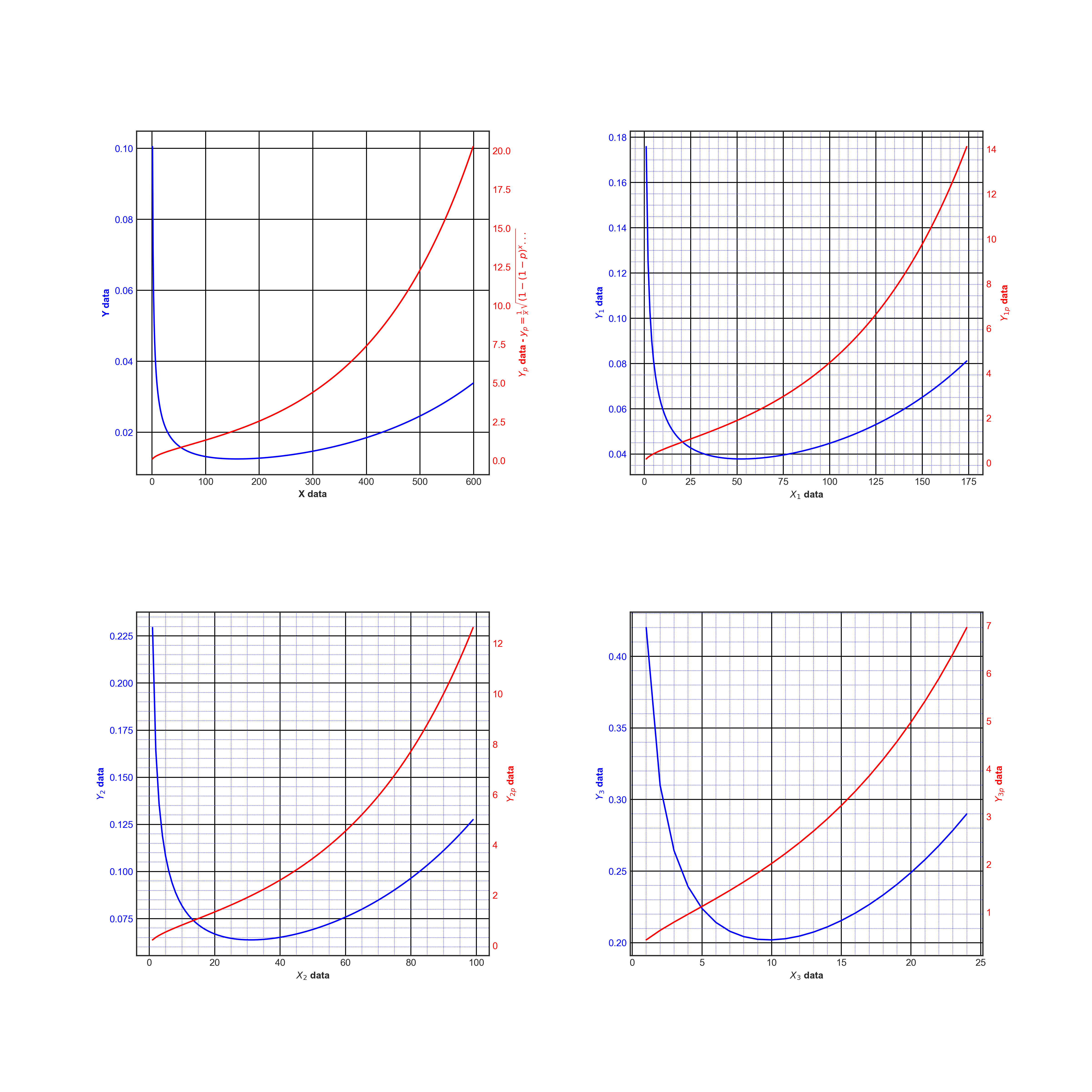
-
on doit pouvoir encore l'améliorer ... mais là ça suffira pour cette fois B-)
import numpy as np import matplotlib.pyplot as plt import os ######## def fonction(p, n): x = np.arange(1, n) y = (1/x)*np.sqrt((1-(1-p)**x)/(1-p)**x) yp = x*y return(x, y, yp) x, y, yp = fonction(p=0.01, n=600) x1, y1, y1p = fonction(p=0.03, n=175) x2, y2, y2p = fonction(p=0.05, n=100) x3, y3, y3p = fonction(p=0.15, n=25) ##### def fonctionPlot(path, x, y, yp, nomX, nomY, nomYp, n): fig = plt.figure(figsize=(16,16)) fig.subplots_adjust(hspace=0.4, wspace=0.4) ax1 = ['ax11', 'ax21', 'ax31', 'ax41'] ax2 = ['ax12', 'ax22', 'ax32', 'ax42'] for k in range(n): ax1[k] = fig.add_subplot(2, 2, k+1) ax2[k] = ax1[k].twinx() ax1[k].grid(which='major', linestyle='-', linewidth='1.', color='black') ax1[k].grid(which='minor', linestyle=':', linewidth='0.5', color='blue') ax1[k].plot(x[k], y[k], 'b-') ax2[k].plot(x[k], yp[k], 'r-') ax1[k].set_xlabel(nomX[k] + ' data', fontweight='bold') ax1[k].set_ylabel(nomY[k] + ' data', color='b', fontweight='bold') ax2[k].set_ylabel(nomYp[k] + r' data - $y_p = \frac{1}{x} \sqrt{ ( 1 - ( 1-p )^{x} ...}$', color='r', fontweight='bold') ax1[k].tick_params(axis='y', colors='b') ax2[k].tick_params(axis='y', colors='r') plt.savefig(path + '/fig.png', dpi=300) Chemin = str(os.getcwd()) fonctionPlot(Chemin, [x, x1, x2, x3], [y, y1, y2, y3], [yp, y1p, y2p, y3p], \ [r'$x$', r'$x_1$', r'$x_2$', r'$x_3$'], \ [r'$y$', r'$y_1$', r'$y_2$', r'$y_3$'], \ [r'$y$', r'$y_1p$', r'$y_2p$', r'$y_3p$'], \ 4) -
merci, vous vous êtes bien amusé
")


Connectez-vous ou Inscrivez-vous pour répondre.
Bonjour!
Catégories
- 163.1K Toutes les catégories
- 7 Collège/Lycée
- 21.9K Algèbre
- 37.1K Analyse
- 6.2K Arithmétique
- 53 Catégories et structures
- 1K Combinatoire et Graphes
- 11 Sciences des données
- 5K Concours et Examens
- 11 CultureMath
- 47 Enseignement à distance
- 2.9K Fondements et Logique
- 10.3K Géométrie
- 62 Géométrie différentielle
- 1.1K Histoire des Mathématiques
- 68 Informatique théorique
- 3.8K LaTeX
- 39K Les-mathématiques
- 3.5K Livres, articles, revues, (...)
- 2.7K Logiciels pour les mathématiques
- 24 Mathématiques et finance
- 312 Mathématiques et Physique
- 4.9K Mathématiques et Société
- 3.3K Pédagogie, enseignement, orientation
- 10K Probabilités, théorie de la mesure
- 772 Shtam
- 4.2K Statistiques
- 3.7K Topologie
- 1.4K Vie du Forum et de ses membres
Qui est en ligne 20


 +10 Invités